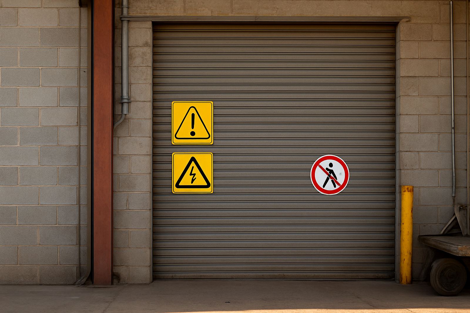
Place the sign where the decision is made, not where it is convenient
One of the biggest mistakes is putting a safety sign too far from the risk. A notice above a gate or on a wall near the office might look tidy, but if the hazard is at the doorway, loading bay or staircase, the sign must be where the person makes the next move. Good placement gives people just enough time to stop, look and change behaviour.
On warehouses, workshops and schools in Bloemfontein, we often see signs mounted where a manager can easily fix them, not where staff or visitors actually approach the danger. The result is simple: the message is there, but it is not being used. In safety work, convenience is not the point. Visibility is.
Think about the path of travel. If somebody is entering from a car park, crossing a yard or pushing a trolley, the sign should be along that line of movement and at eye level where possible. If there is a blind corner, a change in floor level or a restricted access point, that is where the message belongs.
Avoid visual clutter that hides the warning
Even a well printed sign can disappear if it is fighting with too many other messages. Fire instructions, delivery notices, branded posters and wall graphics can crowd the same space. When that happens, the warning loses priority. A safety sign must be the first thing people notice, not the last thing they read.
Clutter is a real problem in busy Free State premises where walls carry paperwork, notices and old stickers that never came down. If a sign sits among too many colours, sizes and fonts, the eye has to work harder. That slows reaction time and can create confusion about what matters most.
Keep the immediate area clean and direct. Use one clear sign for one clear action. Remove old messages that no longer apply. If a sign must share space with other information, make sure the safety message has the strongest contrast and the least obstruction.
- Do not place a warning behind shelving, stacked stock or open doors.
- Do not mount critical signs where glare from windows washes them out.
- Do not place small signs in the middle of a busy noticeboard.
- Do not let faded vinyl or peeling labels compete with active warnings.
Height, angle and distance matter more than people think
A sign that is too high can be missed by pedestrians and drivers alike. A sign that is too low may get blocked by equipment, parked bakkies or temporary stock. A sign that faces the wrong direction can be almost useless, even if the wording is correct. This is where a proper site survey makes a difference.
The best position depends on who needs the message and how they approach the area. A driver needs a sign visible from the cab. A worker on foot needs a sign visible at standing eye level. A person pushing a trolley or moving a pallet needs enough clearance to see the sign before entering the hazard zone. On some sites the best answer is not one sign but two or three, placed for different approaches.
In strong Bloemfontein sunlight, angle also affects readability. Flat mounted signs can reflect too much light, especially on glossy surfaces or pale painted walls. A slight change in angle can improve legibility a lot. For outdoor signs, wind, dust and moisture should also be considered so the sign stays fixed and readable after months of weather exposure.
Use the right material for the environment
Placement is not only about location, it is also about the surface and the conditions around it. A safety sign on a dusty concrete wall, a steel gate, a glass door or a corrugated sheeting panel all need different fixing methods. If the surface is not prepared properly, the sign can lift, curl or fall off, which puts the message at risk.
Coastal humidity is not the only issue in South Africa. Inland sites still deal with heat, dust, rain, constant sun and load-shedding related darkness where reflective or illuminated messaging may be needed. If the sign material is wrong for the environment, it can fade quickly or become hard to read after a few months.
- Use weather suitable finishes for outdoor warning signs.
- Use clean, smooth surfaces for decals and laminated graphics.
- Use fixings that suit the wall, gate or panel material.
- Check that temporary signs are not moved by wind or daily foot traffic.
At Central Signs in Hamilton, Bloemfontein, we see plenty of signs that failed because the surface was never checked first. A sign can only do its job if the mounting is matched to the site conditions.
Do not let maintenance turn into neglect
Safety signs should be inspected regularly, especially in places with vehicles, machinery, cleaning chemicals or public traffic. A sign can be perfectly positioned on day one and still lose its value if it becomes faded, dirty or hidden by new fittings. Maintenance visits help keep the message current and easy to spot.
One common mistake is leaving temporary signs in place long after the job changed. Another is replacing a damaged sign with a smaller or less visible one just to get the area looking neat again. That kind of shortcut may satisfy the eye, but it weakens the warning. When a sign is no longer clear, it is not doing its job.
For many businesses in Mangaung, Botshabelo and Thaba Nchu, the practical fix is to review sign placement whenever the site layout changes. New stock racks, new doors, extra fencing or moved equipment can all block sight lines. If staff have to lean around objects to read a warning, the placement needs to be changed.
A Bloemfontein example that shows why placement fails
On a busy workshop site in Bloemfontein, a no-entry sign had been mounted neatly beside the side door. The problem was that staff entered from a vehicle yard on the other side of the building, where the sign could not be seen until after the door was already open. The sign was technically correct, but practically useless.
We relocated the warning to the approach route, added a second sign at eye level near the handle and removed an old faded notice that was still stuck on the adjacent wall. That small change improved compliance immediately because the warning met people where they were actually moving. The site manager later said the issue had never been the wording, only the position.
That is the point many businesses miss. A safety message can be perfectly written and still fail if it is hidden, too late or placed for the convenience of the installer instead of the user. Good placement is not decoration. It is part of the control measure.
What to check before you install or move a safety sign
If you want a sign to do real work, check the site from the user’s point of view before fixing it in place. Walk the route, look for glare, ask where people pause and note what might block the view later. This is especially important around gates, ramps, loading points, doors and shared pedestrian routes.
- Can the sign be seen before the person reaches the hazard?
- Is it visible from the normal approach direction?
- Will stock, vehicles or open doors hide it?
- Is the height right for pedestrians, drivers or both?
- Will dust, sun or moisture reduce legibility over time?
When safety signs are positioned properly, they do more than fill wall space. They guide behaviour, reduce hesitation and support safer movement on site. That is why placement deserves the same attention as the message itself.