
A clearer route through the practice
The client needed a practical sign package for a healthcare practice in Brandwag where patients could find the reception, consultation rooms, ablutions and staff areas without needing to ask for directions at every turn. In a medical setting, the signs have to do more than look tidy. They must be easy to read, placed at the right height and consistent from one room to the next.
We worked with the practice team to plan the sign positions from the entrance through to the internal corridors. That included visibility from walking distance, light reflection from painted walls and the need for signs that would still read properly during load-shedding when the interior lighting was reduced. The result was a simple signage system that fits the building and the way people move through it.
- Client type: private healthcare practice
- Area: Brandwag, Bloemfontein
- Use: patient wayfinding and room identification
- Finish: clean, low-glare and easy to sanitise
Brief, constraints and site conditions
The brief was straightfoward but specific. The client wanted signs that were easy to understand for first-time visitors, suitable for a professional medical environment and durable enough for daily use. Because the practice serves patients of different ages, the wording had to be direct and the lettering large enough to read at a glance.
There were a few constraints to work around. Some wall sections were narrow, a few doors had limited panel space and one or two areas had sunlight spilling in from the windows during parts of the day. We also had to keep the look calm and uncluttered, since healthcare signage should guide people without adding visual noise.
- Limited wall space on some passages and door leaves
- Daylight glare in certain room entrances
- Need for easy cleaning and regular wipe-downs
- Clear legibility for older patients and visitors
What we supplied and fitted
We supplied a mix of directional signs, door name plates and room identification panels. The set included reception direction signs, consultation room labels, toilet signs and staff-only markers. Where needed, we matched the layout to the actual room names and ensured the wording stayed consistent across the full set.
Materials were chosen for indoor use in a medical environment. We used printed and cut graphics on durable sign panels with a smooth finish, then mounted them neatly so they sat level and secure. For doors and glass areas, we used vinyl lettering and simple iconography to keep the messages readable without crowding the surface. The installation was done cleanly and with minimal disruption to the practice flow.
- Wayfinding panels for corridors and shared areas
- Room name signs for consultation and admin spaces
- Toilet and staff access signs
- Vinyl graphics for glass and smooth surfaces
- Neat installation with measured spacing and alignment
Artwork setup and production detail
Once the room list and sign schedule were confirmed, we handled artwork setup and prepared the final layouts for print and cutting. The typography was kept bold enough for short viewing distances and the symbols were selected for instant recognition. In a clinic environment, less is usually better, so we avoided unnecessary decoration and focused on clear information.
The production process included print production, vinyl cutting and graphic lamination where needed for added surface protection. This helped the signs handle regular cleaning better and reduced wear on the printed areas. The final finish was chosen to limit reflections from overhead lights and to keep the appearance consistent through the building. Small details like letter spacing and edge trimming were checked carefully before installation, because that is where signs either feel professional or they dont.
Installation day in Brandwag
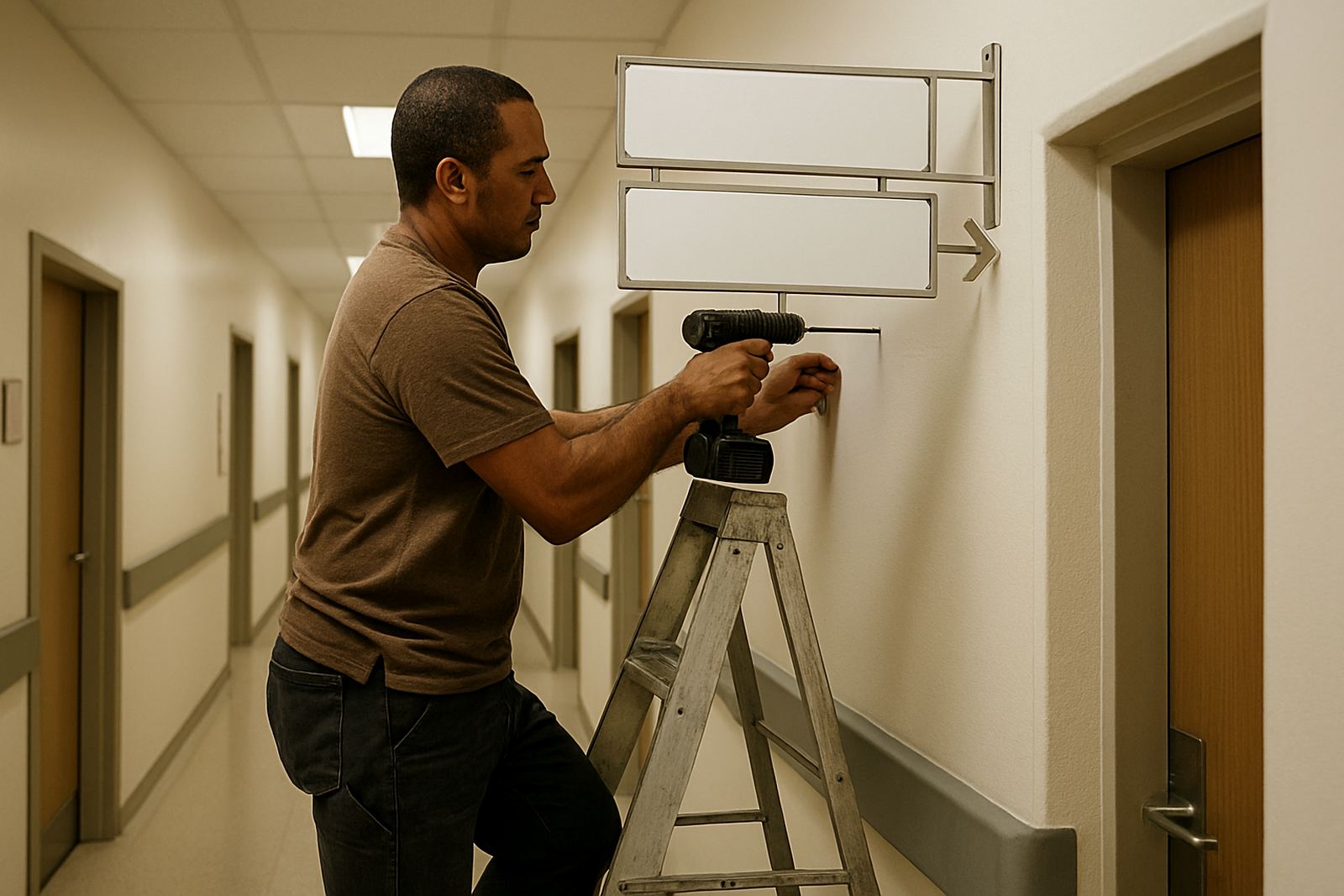
Installation was scheduled to suit the practice hours and to keep interruption low. Our installer worked room by room, starting with the main directional points and then fitting the door and wall identification signs once the route layout was confirmed on site. The process also included a final check on sightlines from the reception area and corridor junctions.
The fitting stage went quickly because the site survey had already covered wall finishes, fixing points and room dimensions. That meant we could work with the correct mounting method from the start instead of adjusting on the fly. The finished signs were level, consistent and easy for staff to use when directing patients.
- Site survey completed before production
- Measured fixing points for each sign location
- Installation planned around practice operating times
- Final alignment and visibility check done on site
Result for patients and staff
The main result was simpler movement through the practice. Patients can now follow the signs from the entry point to the correct room without stopping to ask for help at every junction, which saves staff time and reduces confusion at busy periods. The practice also has a neater and more consistent appearance across the corridors and doors.
For a healthcare site, that kind of signage does a few jobs at once. It supports better flow, reduces repeated verbal directions and gives visitors confidence that they are in the right place. The signs also hold up well to regular wiping, which is important in clinics where surfaces are cleaned many times a day. Overall, the job gave the premises a clearer structure and a more organised patient journey.
What we would do again on a similar clinic job
On a similar healthcare project, we would follow the same approach: confirm the room list early, survey the site before production and keep the wording short. We would also keep a close eye on light conditions, especially where glass doors or bright window areas can affect readability. That planning saves time and avoids rework later on.
If the practice expands or rooms are renamed, we can add new signs, adjust directional points or carry out maintenance visits to keep the system current. Medical signage works best when it stays accurate and tidy, so we always build it with future updates in mind. It is a simple principle, but it saves a lot of hassle down the line.
- Best practice: confirm all room names before print
- Keep copy short and consistent
- Allow for future room changes or additions
- Use finishes that handle regular cleaning
Key facts
| Project | Brandwag Clinic signs |
|---|---|
| Town | Brandwag, Bloemfontein |
| Scope | Wayfinding and room identification |
| Services used | Site survey, artwork setup, print production, vinyl cutting, sign installation |
| Materials | Printed sign panels, cut vinyl, laminated graphics |
| Timeline | 2 weeks from survey to installation |