Start With Viewing Distance, Not the Wall Space
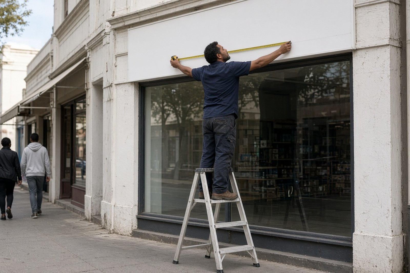
The biggest mistake with shop signs is starting with the available wall and working backwards. A sign can fit neatly on a fascia and still be too small to read from the street. The real question is how far away a customer will be when they first need to recognise your name.
In Bloemfontein, that distance changes from one site to the next. A shop in a slow-moving retail centre can work with smaller lettering than a business on a main road where drivers are moving past at 40 to 60 km/h. If people only get a quick glance, the sign needs stronger letter height, simpler wording, and fewer extras. If they are already parked and walking towards the entrance, you can make use of more detail.
As a simple guide, the more distance between the viewer and the sign, the bigger the letters must be. It sounds basic, but it matters more than fancy graphics or a long slogan. We often remind clients that a sign is not a poster. It has one job first: be seen and understood in a few seconds.
Send a short note with your site, sizes and timing and we come back within one working day.
Contact form